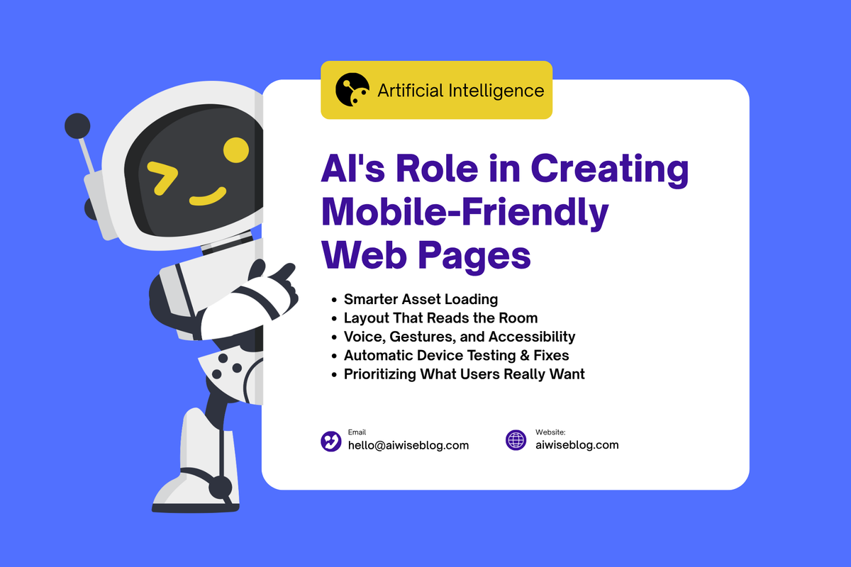
AI's Role In Creating Mobile-Friendly Web Pages
AI enhances mobile-friendly web pages by optimizing layouts, improving load speeds, personalizing content, and ensuring seamless user experiences across all devices.

I remember when I first tried squeezing a full site onto a tiny smartphone screen. Images jutted out, text overflowed, and buttons were impossibly close together. It was frustrating. But now, with AI tools, websites can adapt in ways that feel… well, almost magical. They don’t just shrink—they flow, shift, and anticipate.
Here’s a fresh look at how AI is changing mobile web design, what to watch out for, and ways you can benefit without losing control or personality.
Why It Really Matters That Mobile Works Well
People use phones for everything — ordering food, catching up on news, doing banking, messaging friends. If a page takes too long or looks awkward, most users bounce. Literally.
Also, Google cares. Their “mobile-first” indexing means the mobile version of your site is what counts for search rank. Slow load times, messed-up layouts, unclickable buttons—all that drags you down.
So yes, getting mobile right is no longer optional. It’s essential.
Ways AI Makes Mobile Web Pages Smarter
Here are the real, concrete ways I’ve seen AI improve mobile experiences. Some are surprising.
1. Layout That Reads The Room
Instead of assuming the user is always holding their phone vertically, AI can detect orientation, screen size, maybe even device type, and then tweak the layout. Think: hiding non-essential sidebars, moving key buttons lower for thumb reach, and scaling fonts so they stay readable without zoom.
It’s less about fixed breakpoints (“mobile”, “tablet”, “desktop”) and more about fluid, context-aware design.
2. Prioritizing What Users Really Want
Not everyone coming to your site is looking for the same thing. AI can use prior data (what other mobile users did) to guess what a new visitor is likely to click. Then the site can show those parts first.
For example, showing “Latest Reviews” near the top rather than pushing it down under a big hero section if past users always scroll straight there. It’s about reading behaviour and adapting.
3. Smarter Asset Loading
Heavy images, fancy scripts—they can kill mobile performance. AI helps by choosing what to load first. Maybe load a low-res version first, or delay loading a large banner until the user scrolls near it. Or prefetch elements based on what users tend to do.
Result: fast initial view, smoother feel later. Less waiting.
4. Automatic Device Testing & Fixes
It’s tedious to try your site on dozens of phones and tablets. AI tools can simulate lots of devices and catch layout glitches, unreadable text, and overlapping elements. They spot things you might not notice—like how a button looks on an Android with low brightness or how a dark mode image bleeds.
Some tools even suggest fixes automatically. That saves hours of manual tweaking.
5. Voice, Gestures, and Accessibility
Phones aren’t always used with fingers. Voice commands, swipes, and gestures are growing. AI helps sites become easier to use with these inputs. For example, sites that respond to voice search well, that allow navigating with swipes, and that adapt UI for one-hand use.
Also, accessibility: adjusting contrast, offering alt text, and ensuring touch targets are large enough. AI can flag potential problems and suggest improvements.
Real Examples That Work
I’ve worked with (or seen) companies using these AI tricks with good payoff:
1️⃣ Small Shop Owner: used an AI plugin to compress and resize product images differently for mobile vs. desktop. Mobile load times halved, mobile sales up 20%.
2️⃣ News Blog: rearranged sections for mobile visitors based on what categories they clicked most. Engagement jumped.
3️⃣ SaaS Dashboard: removed sidebar for mobile users and moved most important action buttons to the bottom. People complained less about misclicks.
These aren’t top secret or only for huge companies. Often, the gains are quick and visible.
Things To Be Careful With
AI helps—but misused, it can hurt.
✅ Overpersonalisation Backfires: If content shifts too much for different users, it can feel inconsistent. One user might see one layout, another a wildly different one. That can confuse branding.
✅ Assuming Past Behaviour Equals Current Intent: Just because earlier visitors did X doesn’t mean everyone wants the same. Always allow flexibility.
✅ Performance Overhead: Some AI tools themselves add scripts, tracking, or heavy files. If you’re not careful, you solve one problem and create another.
✅ Accessibility Slip-Ups: Automation might miss details—alt text, keyboard navigation, voice navigation. Always check manually.
✅ Design Feel And Personality: AI might favour what “works” (based on data) but strip away what makes your website yours—style quirks, brand voice, and visual uniqueness. Don’t lose that.
How To Introduce AI Into Your Mobile Design Process
Here’s a suggested path that feels manageable and keeps balance:
➡️ Audit Your Current Mobile Site
Use tools to measure load times and identify pain points (e.g., images that are too big, misaligned buttons). Real user feedback helps too.
➡️ Pick Small Experiments
Maybe try an AI-driven image optimiser or layout tool on one landing page. See how it performs before broader rollout.
➡️ Keep Design Consistency
Define what must remain: your logo’s placement, brand colours, and headline styles. Let AI tweak the layout, but keep anchors so users still recognise you.
➡️ Use Real User Behaviour Data
AI will make better suggestions if it has good data. Track clicks, scrolls, and dwell time. Feed that back in.
➡️ Regularly Test And Adjust
New phones appear, new OS versions, new screen sizes. Stay current. Revisit every few months.
➡️ Monitor Metrics That Matter
Bounce rate, time on page, conversion rate, mobile speed. Don’t get lost in fancy tech metrics alone.
Final Thoughts
Mobile-friendly design isn’t just about fitting content onto a smaller screen. It’s about meeting people where they are—on their phones, often on the move, with limited attention. AI doesn’t replace thoughtful design. It amplifies it.
If you use AI tools carefully—listening to users, safeguarding your brand voice, testing often, and keeping performance as a priority—you’ll end up with mobile pages that feel natural, load quickly, and serve both your audience and your goals.
If you want, I can help you build an outline tailored to your website or suggest specific AI tools that match your budget and design style.
FAQs: AI & Mobile-First Web Design
Can a Non-Tech Person Use AI Tools To Improve Mobile Friendliness?
Yes. Many tools have plug-and-play UIs, with dashboards and visual previews. You don’t always need code. But basic awareness helps—knowing what a good layout looks like and what smooth performance feels like helps you make better choices.
Will AI-Driven Layout Look Generic?
It can, if you rely totally on templates or tools that offer few customisation options. However, you can choose tools that allow for branding, color, typography, and spacing tweaks. The best approach is to combine AI suggestions with designer input.
How Do I Measure If Mobile Changes Are Effective?
Track load times, bounce rates, scroll depth, and conversion rates (if applicable). Also, user feedback—ask mobile users whether things feel easier to use. Sometimes, qualitative feedback reveals issues metrics miss.
Is It Expensive To Adopt AI For Mobile Design?
It depends. Some tools are free or affordable. Others are premium. But often, incremental adoption—starting with one page, a plugin, or a small AI feature—lets you test cost vs benefit. Many businesses find ROI quickly if mobile traffic is significant.
What Are Signs That AI Is Making Things Worse Instead Of Better?
When design changes confuse users, when pages feel inconsistent, and when performance dips, metrics like bounce rate or exit rate often increase after changes. Also, if branding or user trust suffers (e.g., customers complain). Those are red flags to dial back or adjust.
Read More :- Aiwiseblog.com


